
Color can convey underlying emotion and distinguish key data points, but it shouldn’t be used as the sole contributor to identify something. It’s also important to make sure that any colors used are significantly different from the colors surrounding it so that items can be easily read and distinguished.
What does this mean?
When picking colors for our text and icons, we want to make sure that the contrast between adjacent colors is significant enough. A contrast ratio refers to the difference in brightness and darkness between the item and the background. We need colors in our designs to meet a minimum contrast ratio based on the Web Content Accessibility Guidelines. You can easily check if your chosen colors meet this minimum contrast ratio by using a color contrast checking tool.
| Good Contrast | Bad Contrast |
| Good Contrast | Bad Contrast |
After confirming that the color contrast is sufficient, we also need to check the way that we are using the color. Because people who use our content may be impacted by color blindness, we need to ensure that color is not the only way we identify something.
For example, if you are trying to denote a value as passing a test, do not simply change the value’s color to green. You may still use a color change, but there must be another indicator of the meaning as well. In this example, you could also include a check mark or text that says “Pass” or “Good.”
Application
Always check the contrast of the colors you intend to use before solidifying a design. When using a color contrast checking tool, verify that your selections meet the AA requirements for your appropriate size text or graphic. It’s okay if they fail the AAA standards as those are not required by Pitt’s EIT Policy or federal law.
The main application for ensuring that color is not the only identifier comes when presenting data.
Charts and graphs frequently use different colored lines, points, or bars to distinguish separate data. We need to additionally use either patterns or labels to ensure accessibility.
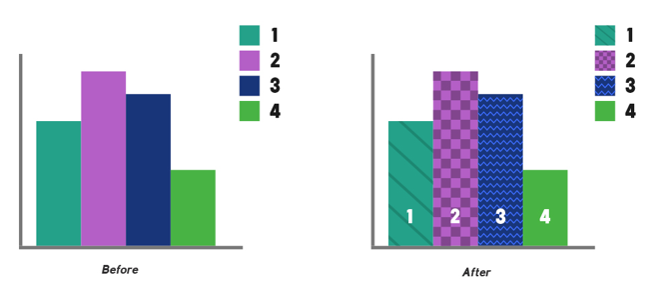
Text labels on the data provide the most clarity, but these are usually only possible with short dataset names. Patterns are another easy way to add clarity and are built-in to most statistical software. Patterns like the ones shown on the example below should be used for bar charts and pie charts. For line graphs or scatter plots, utilize solid, dashed, and dotted lines and variable shapes for the data points (Ex. squares, circles, triangles, stars, etc.)
Impact
1 in 12 men in the United States have some form of color vision deficiency or color blindness according to the National Eye Institute. This also impacts about 1 in 200 women. This significant group of people depends on additional labelling to understand items that typically have color-based identifiers. Having labels or additional identifiers can also improve content understanding for those in the autism community who benefit from clear, specific instructions.
Those with color blindness and those with low vision need high contrast colors to be able to read or understand our content. Using high contrast colors can also benefit non-disabled users who may be trying to read something from far away, such as the back of a meeting or classroom